Streamlining SaaS with Design Systems
The case study is centred on building a scalable and intuitive design system for Rigi’s SaaS platform supporting digital creators. This case study discusses the design system’s creation, focusing on component organisation, visual consistency, and ensuring seamless user flows across the platform’s different product workflows. By incorporating a tone of voice that is both approachable and innovative, we aimed to craft a system that not only enhances operational efficiency but also delivers a user-centric, engaging experience for creators.
Client
Rigi Club
Date
September 2024
Industry
SAAS
Scope of work
Desktop web
Mweb
Design System
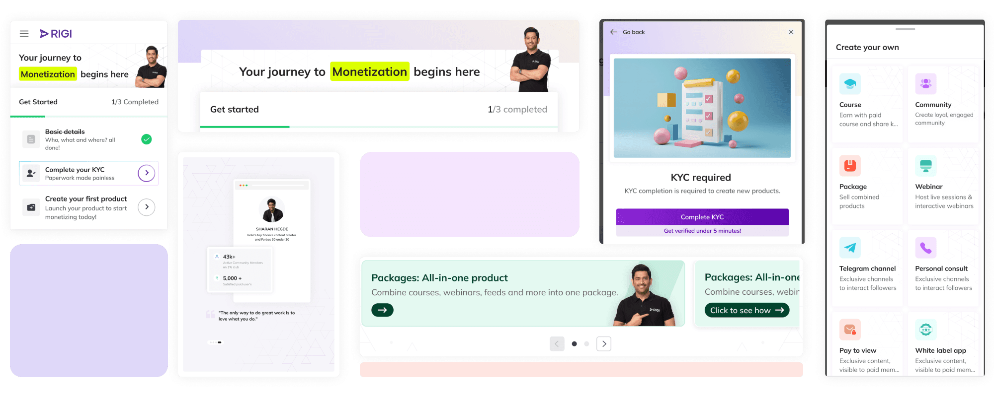
Design System Workflow Breakdown
First, understanding how the design system would apply to the SaaS tool, which enables creators to sell various digital products like courses, webinars, personal consultations, etc. We began by identifying and breaking down the product's workflows before designing its visual and component system. Four primary workflows were identified:
Dashboard: A central hub for accessing products, analytics, settings, and initiating product creation.
Product Creation: Six distinct product types, each with its own creation flow.
Post-Creation: Returning to the dashboard to analyse sales and engagement metrics for created products.
Landing Page: The end-user's view of these products.
Tone of Voice
After conducting exercises in setting mood-board and iterating a few options, I developed a tone of voice for our brand that aligns perfectly with our business objectives.
The tone being minimal, clean, innovative, and infused with a hint of quirkiness. This blend creates a unique and engaging voice that resonates with our audience.
Approachable
We aim to make complex processes simple and accessible.
Innovative
We embrace new ideas and technologies to stay ahead
Friendly
Our tone is warm and inviting, making users feel supported.
Quirky
We add a touch of pop colours and creativity to keep interactions interesting.
UI KIT
View in Figma
Next, we focused on identifying the types of UI Kit components to include in our design system. However, there was uncertainty about how these components would be styled and laid out. To address this, we referenced the existing information architecture from previous designs and categorized components into types such as cards, carousels, text fields, and interactions. This process provided clarity on the UI Kit and how to apply the tone of voice to these elements.
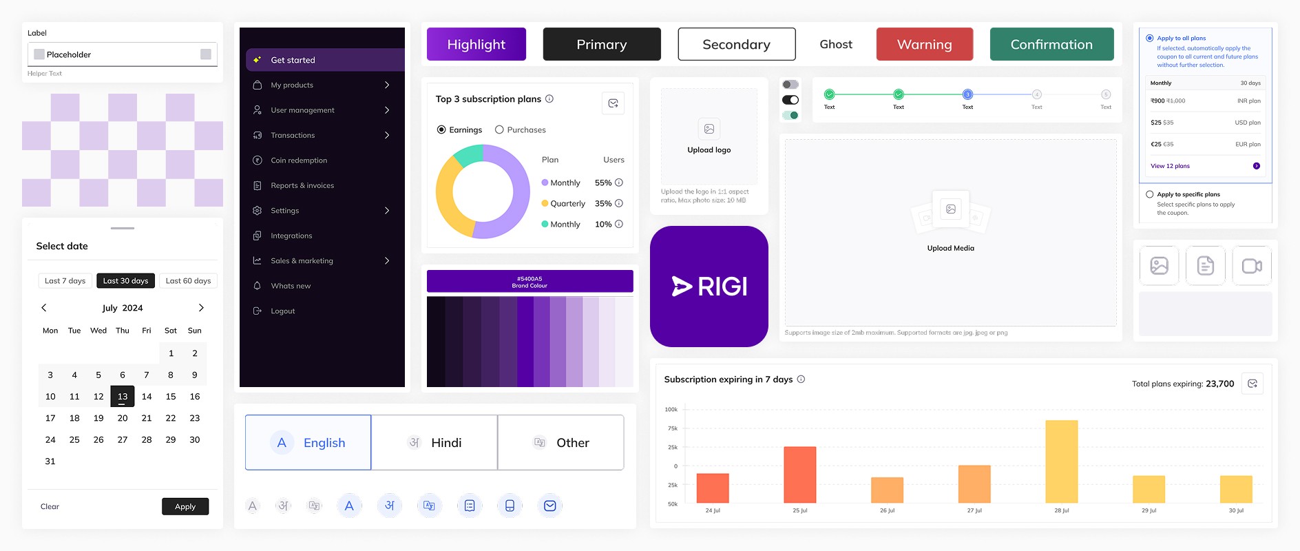

Setting a Scalable Brand Color
Step 2 involved creating color palettes on two levels:
Enhancing the Tone of Voice: Developing colors that complement and enhance the tone of voice for the self-serve project.
Scalability and Adaptability: Designing palettes that can scale and adapt to various brand colors, accommodating our white label services.
Solution: The the base colors and their shades would need to be replaced with our brand color. To solve this, we needed multiple shades of the brand color to maintain its essence across digital experiences.
Approach
We used the brand color as the base and created lighter and darker shades
Lighter Shades: We reduced the opacity of the brand color on a white background. Darker Shades: We increased the brightness value by increments. This approach ensures our brand color remains consistent and adaptable across different applications.
Ensuring Base Color Compatibility
Sometimes, a client's brand color might be too light or too dark to serve as a suitable base color or Shade 500 in our format.
Solution: To address this issue, we decided to adjust the brand color to a compatible version that fits our shading system. However, we still use the original brand color as is for the primary Shade 500, ensuring consistency with the client's brand identity while adapting it for our design framework.
Semantic Colors
In UI design, semantic colors play a crucial role in conveying meaning and enhancing user experience. These colors are chosen not just for aesthetics but to communicate specific information or actions, such as success, warning, or navigation. By carefully considering contrast and accessibility, we selected our base semantic colors
We created ten shades for each color by gradually decreasing the opacity and adding a 1 color with higher saturation for each for readability with darker tints
Colors for Typeface
We aimed for a subtle yet impactful typography color, opting for "black but not black." After experimenting with various shades in different settings, we settled on a range of black and grey tones to enhance the text's visual appeal.
Colors for Icons
For icons, we chose a dark blue shade that complements both the icons and text effectively. To ensure versatility, we created ten shades by gradually decreasing the opacity, allowing for seamless integration across different design elements.
Focus Fusion Colors
A dynamic set of colors in our design system, to highlight key elements such as banners, pop text, and ads. This palette combines both bright and pastel hues, allowing us to create a versatile visual language that captures users' attention. The bright colors in Focus Fusion are ideal for drawing immediate attention to critical information, while the pastel shades add a softer touch, perfect for subtle highlights or background accents. By integrating these contrasting yet complementary colors, we enhance the visual hierarchy of our UI, ensuring that important elements stand out while maintaining a balanced and engaging user experience.
Mulish: A Versatile Choice for Digital Interfaces
We selected Mulish as our primary text font to ensure consistency and clarity across our design system. Mulish, a sans-serif font, is optimised for digital interfaces with its clear letterforms and high x-height, which enhance readability on various screen sizes and resolutions. Its wide range of weights and support for multiple languages make it versatile for different design needs. From a typographic standpoint, Mulish's well-balanced spacing and moderate contrast between thick and thin strokes contribute to its legibility, making it an excellent choice for both desktop and mobile web applications. This typeface also sat well with the tone of voice
Refining Designs in Grayscale
To refine our design, I created several UI wireframe iterations of key features using pen and paper. This process helped develop effective design solutions that fit seamlessly into our system. The main challenges we faced involved optimising the layout, navigation, and interactions. I will delve deeper into the specific issues encountered in each area and explain how we addressed them.
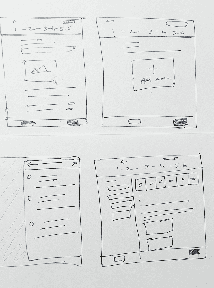
Navigation
The next design system component to address involved navigation and interaction. Two key challenges emerged:
Managing the main menu on the dashboard with multiple nested layers.
Developing a creation layout that supports a three-level interaction for streamlined creation.
Dashboard Navigation
We implemented a multi-nested layer approach for dashboard navigation to ensure users remain aware of their current location and can easily navigate to other features.
Creation Navigation
Here we divided the layout into 3 level. Steps, the main layout and side sheet/bottom sheet
Accelerating Development with UI Components
Once we had designed and integrated the UI components, bringing everything together, the project gained significant momentum. The comprehensive design system allowed for rapid development and iteration, which greatly accelerated the pace of work. This increased speed was particularly beneficial for the business, as it enabled faster deployment of features and improvements, ultimately enhancing operational efficiency and productivity.